ShopDreamUp AI ArtDreamUp
Deviation Actions


Description
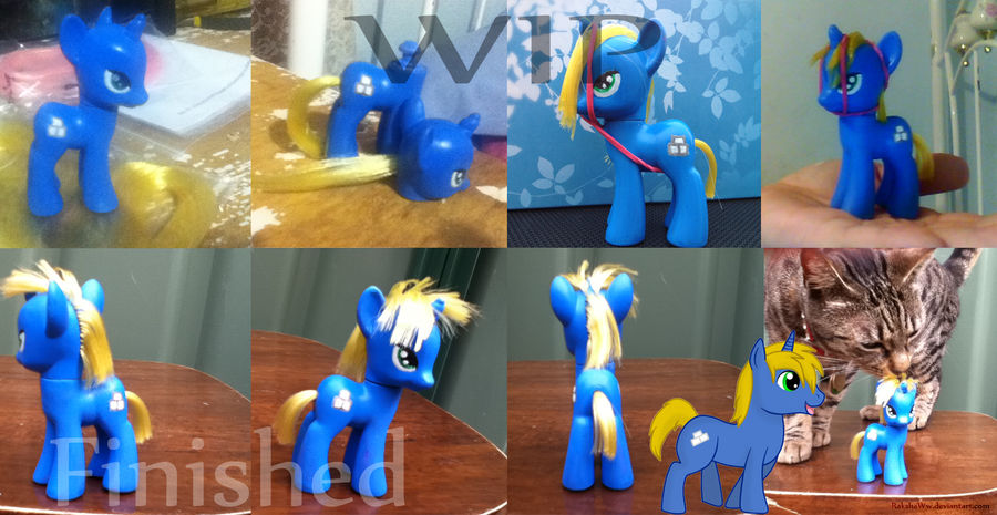
Sorry for the bad pictures.. It looks much better irl, and the hair aint as.. poofy xD
Well... This was something new for me 8D
I could say this is my second attempt, although my first success xD I tried to do my Ponysona Wish, although I painted it wrong (paint was to thick and the brushes weren't good enough), so I bought better, higher quality stuff and made my boyfriends pony (Smile)") Which turned out better than I had thought, although I'm hoping to get better at painting eyes and styling hair in the future xD This could have also used a few more layers of paint since there's still some purple showing (This used to be a Twilight Sparkle one) in some places, but oh well. To lazy to fix that up. I'm sure *Rushalike won't mind if it's not 100% perfect xD
Which turned out better than I had thought, although I'm hoping to get better at painting eyes and styling hair in the future xD This could have also used a few more layers of paint since there's still some purple showing (This used to be a Twilight Sparkle one) in some places, but oh well. To lazy to fix that up. I'm sure *Rushalike won't mind if it's not 100% perfect xD
The next one I'll be making is my pony, White Wish, then I'll give ~TimberWolfie's Red Carpet a go xD She has two mane colours (Not to mention black, which is hard to get!), so I'll see if I can do it.
If anyone has a tutorial on anything you see that could use improving (Mane styling, eye painting etc) please link me")
Time Taken: 4 days
Made for + Character: *Rushalike
Paint + Hair: Dollyhair
Well... This was something new for me 8D
I could say this is my second attempt, although my first success xD I tried to do my Ponysona Wish, although I painted it wrong (paint was to thick and the brushes weren't good enough), so I bought better, higher quality stuff and made my boyfriends pony
The next one I'll be making is my pony, White Wish, then I'll give ~TimberWolfie's Red Carpet a go xD She has two mane colours (Not to mention black, which is hard to get!), so I'll see if I can do it.
If anyone has a tutorial on anything you see that could use improving (Mane styling, eye painting etc) please link me
Time Taken: 4 days
Made for + Character: *Rushalike
Paint + Hair: Dollyhair
Image size
1706x881px 6.99 MB
© 2012 - 2024 RakshaWw
Comments9
Join the community to add your comment. Already a deviant? Log In
I personally think the tail should be a little bit higher and he should be a little longer and maybe make his ears smaller and less wide and the main should go lower down on his neck and the nose shouldn't slope down so low, like make it thicker and straight across and make his legs a TINY bit thinner and make the dip a bit deeper on the part where his leg meets his thy and make the top of his but a bit lower and more fluent and his eye a bit more rounded but other than that it looks AWESOME!!!!!! its wayyyyyyyyyyy better than i could've done! and i know its critiqueing alot but the minimum of words was 100 so i had to add more! it looks AWESOME btw! keep up the work... wait i said that already... oh well, it does <img src="e.deviantart.net/emoticons/let…" width="15" height="15" alt="